The grid system of Bootstrap
The general idea of both BootsFaces and Bootstrap is to apply the lesson learnt by generations of typesetters to the world of websites and applications. Most people like pages with a lot of white space. Plus, they like a clear structure. It's surprisingly simply to achieve this goal. Put everything into a container that provides a lot of white space surrounding the payload area, and divide the payload area into twelve equal-sized columns. Align everything to this grid:
What seems as an annoying restriction at first, turns out to be a big plus. Everybody can create attractive web applications with little effort. The grid system and the well-thought color scheme of Bootstrap make it almost impossible to create a page that doesn't look nice.
Basic usage
Hint To understand this page better, check out this demo project. It doesn't cover exactly this page, but it's a good starting point to play with the grid system of BootsFaces.
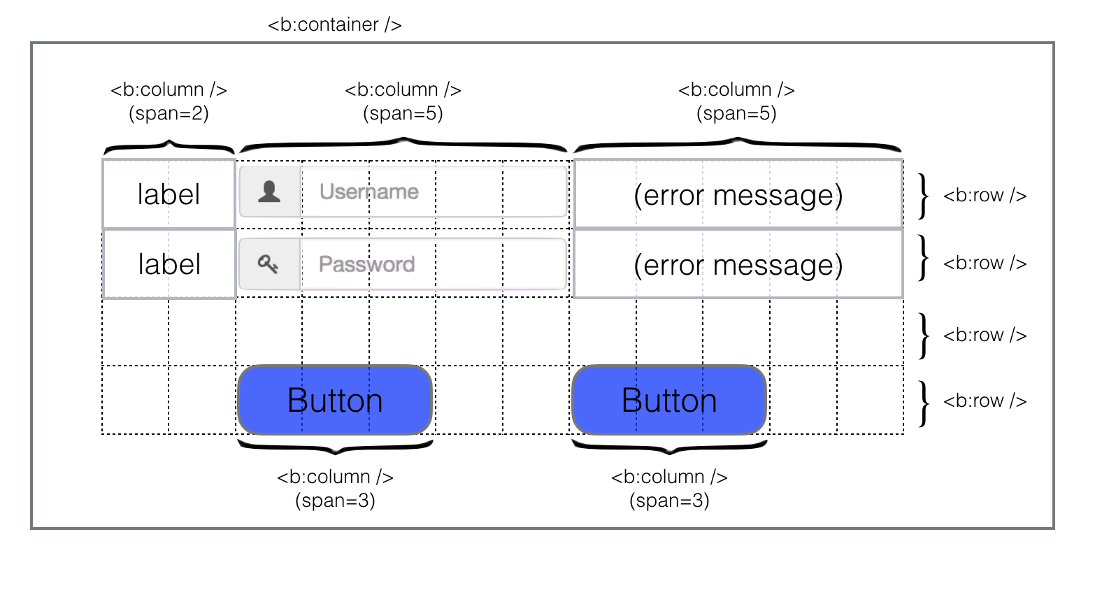
You can see the building blocks of every BootsFaces application in the image above:
- Every BootsFaces page should have a
<b:container />. That's the component providing the generous white space around your payload area. As a rule of thumb, everything must be put in a container, and every BootsFaces page needs a container. But only one. Don't try to nest containers.
It goes without saying that the white space around your widgets may look nice, but it's also a waste of space. Screen estate is a scarce resource. You can get rid of the border by using the attributefluid="true". - The grid is made of
<b:row />and<b:column />.<b:row />is a simple component that usually doesn't need any parameters. - A
<b:column />spans one of more grid columns. You can define different column spans for different screen sizes. More on this in a minute. For now, suffice it to say that it's usually a good idea to optimize the screen for medium sized or small screens. Your layout will scale seamlessly on larger screens, and still be usable on smaller screens. To define that a column spans three grid columns on almost every laptop or desktop PC, use the attributemedium="3". For those who're already familiar with Bootstap: that's the same ascol-md="3". The generated HTML code is<div class="col-md-3" />.
Putting it into action
Live preview
Responsive design
We'll explain the responsive design of BootsFaces in a minute. But we can show it now. Resize your browser window slowly. Make it smaller. When the window is too small to display everything side-by-side, the widgets are stacked on top of each other.
Why BootsFaces? Why not using Bootstrap natively?
BootsFaces takes full advantage of Bootstrap's Grid system while maintaining the benefits of being a JSF framework. Actually, we believe it's more concise and more expressive than programming Bootstrap natively. Convince yourself: inspect the source code of the demo in your browser's source code view. After reformatting, the form is 81 lines. The JSF source is is 45 lines.
BootsFaces being a JSF framework means that you can leverage Bootstrap's layout feature using - for example - the JSF templating system and JSF's conditional rendering to achieve and maintain very complex layouts without much effort.
This website is an example itself: it uses a page template with ui:insert and ui:include and the pages are ui:compositions.
Understanding BootsFaces Grid System
We've already talked about the Bootstrap grid. Let's cover the topic in more detail.
The central idea is to divide the page into 12 equal-sized columns. Each element of your page - be it an input field, a label, a table or a text - covers several of these columns. Widgets can't cover half a column. You're limited to integer multiples: one, two, three, ..., up to twelve columns. At first glance this sounds like a severe restriction, but in practice 12 columns offer enough flexibility for almost every use case. At the same time, being limited to twelve columns usually ensures an attractive page design.
The second central idea is to avoid horizontal scrolling. If your screen is wide enough to display the twelve columns side-by-side, do it. If not, stack the columns on top of each other. This means you have to do a lot of horizontal scrolling on small phone displays. But that's still better than having to scroll both horizontally and vertically. Users can use your application even if screen estate is scarce.
Grid options| Extra small devices Phones (<768px) | Small devices Tablets (≥768px) | Medium devices Desktops (≥992px) | Large devices Desktops (≥1200px) | |
|---|---|---|---|---|
| Grid behavior | Horizontal at all times | Collapsed to start, horizontal above breakpoints | ||
| Max container width | None (auto) | 750px | 970px | 1170px |
b:column attributes |
col-xs or tiny-screen |
col-sm or small-screen |
col-md, medium-screen or span |
col-lg or large-screen |
| # of columns | 12 | |||
| Max column width | Auto | 60px | 78px | 95px |
| Gutter width | 30px (15px on each side of a column) | |||
| Nestable | Yes | |||
| Offsets | N/A | Yes | ||
| Column ordering | N/A | Yes | ||
Example: Stacked-to-horizontal
Using a single set of col-md=* or span=* attributes,
you can create a basic grid system that starts out stacked on mobile devices and tablet devices (the extra small to small range)
before becoming horizontal on desktop (medium) devices.
The span=* and offset=* attributes are meant for this common special use case, to speed up markup writing
Live preview
Example: Mobile and desktop
Don't want your columns to simply stack in smaller devices? Use the extra small and medium device grid attributes including
col-xs=* and col-md=* in your columns. See the example below for a better idea of how it all works.
Live preview
Example: Mobile, tablet, desktops
Build on the previous example by creating even more dynamic and powerful layouts with tablet col-sm=* attribute.
Live preview
Offsetting columns
Move columns to the right using offset=* or col-md-offset=* attribute.
These attributes increase the left margin of a column by * columns.
For example, offest=4 moves a span=4 over four columns.
Live preview
Nesting columns
To nest your content with the default grid, add a new row and set of col-md=* columns within an existing
col-md=* column.
Nested rows should include a set of columns that add up to 12.
Live preview
Alternative attribute names and valuessince 0.8.1
You can choose from two alternative spellings to define the column span:
col-xs,col-xs,col-xsandcol-xsfollow the tradition coined by Bootstrap.- Alternatively, you can use the symboliv names
tiny-screen,small-screen,medium-screenandhuge-screen.
You can also use symbolic names to indicate how many columns to span, at least for some common cases:
medium-screen="full-width"amounts tocol-md="12".medium-screen="half"amounts tocol-md="6".medium-screen="one-third"amounts tocol-md="4".medium-screen="two-thirds"amounts tocol-md="8".medium-screen="one-fourth"amounts tocol-md="3".medium-screen="three-fourth"amounts tocol-md="9".
Hiding columns on certain screens
There are two attributes allowing you to hide columns depending on the screen size:
hiddenhides an element on a certain screen size and below. For example,hidden="sm"hides the element on small (sm) and extra-small (xs) screens.visibleshows an element on a certain screen size and above. It also hides it on smaller screens. For example,visible="smshows the element on small (sm), medium (md) and large (lg) screens.
Beware: These attributes behave different than the underlying Bootstrap library. To alleviate this, we introduced a second syntax of the parameter:
- Lists of sizes: for instance,
hidden="xs,lg"hides the element on tiny and large screens, while showing it on small and medium screens. - Ranges:
hidden="xs...md"hides the element on tiny and medium screens, and on every screen size between (i.e. small screens). - Open ranges:
hidden="...md"hides the element on medium screens and everything below. - Analogously,
hidden="sm..."hides the element on small screens and everything above.
Corner cases: zero columns
You can define a column to span zero columns. That's equivalent to using the hidden attribute.
Disabling the contentSince 1.1.0
By setting the flag contentDisabled="true" you can set each child element of
<b:container, <b:row, and <b:column to disabled. More precisely,
the panels of the accordion are wrapped in a disabled fieldset, which disables input fields, checkboxes and buttons, but
not every component. In particular, tabs and panels still work. You'll also have to be careful about
links (everything that's using an <a> tag, like <button> and <b:navLink>.)
These elements will be shown as disbled, but still are accessible. In part, that's because this CSS property isn't fully
standardized yet. For instance, it isn't supported by Internet Explorer 11 and below, and Opera 18 and below.
Live preview
Reference section
| Attribute | Default value | Description |
|---|---|---|
| auto-update autoUpdate (alternative writing) |
false | Setting this flag updates the widget on every AJAX request. |
| content-disabled contentDisabled (alternative writing) |
false | Enables or disables every child element of this container. By default, child elements are enabled. |
| dir | (none) | Direction indication for text that does not inherit directionality. Legal values: ltr (Default. Left-to-right text direction), rtl (Right-to-left text direction) and auto (let the browser figure out the direction of your alphabet, based on the page content). |
| fluid | false | Boolean value default is false; when set to true, the container will be "fluid": a full width container, spanning the entire width of the viewport. |
| id | (none) | Unique identifier of the component in a namingContainer. |
| rendered | false | Boolean value to specify the rendering of the component, when set to false the component will not be rendered. |
| style | (none) | Inline style of the input element. |
| style-class styleClass (alternative writing) |
(none) | Style class of this element. |
| tooltip | (none) | The text of the tooltip. |
| tooltip-container tooltipContainer (alternative writing) |
body | Where is the tooltip div generated? That's primarily a technical value that can be used to fix rendering errors in special cases. Also see data-container in the documentation of Bootstrap. The default value is body. |
| tooltip-delay tooltipDelay (alternative writing) |
0 | The tooltip is shown and hidden with a delay. This value is the delay in milliseconds. Defaults to 0 (no delay). |
| tooltip-delay-hide tooltipDelayHide (alternative writing) |
0 | The tooltip is hidden with a delay. This value is the delay in milliseconds. Defaults to 0 (no delay). |
| tooltip-delay-show tooltipDelayShow (alternative writing) |
0 | The tooltip is shown with a delay. This value is the delay in milliseconds. Defaults to 0 (no delay). |
| tooltip-position tooltipPosition (alternative writing) |
(none) | Where is the tooltip to be displayed? Possible values: "top", "bottom", "right", "left", "auto", "auto top", "auto bottom", "auto right" and "auto left". Default to "bottom". |
| Attribute | Default value | Description |
|---|---|---|
| auto-update autoUpdate (alternative writing) |
false | Setting this flag updates the widget on every AJAX request. |
| content-disabled contentDisabled (alternative writing) |
false | Enables or disables every child element of this container. By default, child elements are enabled. |
| dir | (none) | Direction indication for text that does not inherit directionality. Legal values: ltr (Default. Left-to-right text direction), rtl (Right-to-left text direction) and auto (let the browser figure out the direction of your alphabet, based on the page content). |
| id | (none) | Unique identifier of the component in a namingContainer. |
| rendered | false | Boolean value to specify the rendering of the component, when set to false the component will not be rendered. |
| style | (none) | Inline style of the input element. |
| style-class styleClass (alternative writing) |
(none) | Style class of this element. |
| tooltip | (none) | The text of the tooltip. |
| tooltip-container tooltipContainer (alternative writing) |
body | Where is the tooltip div generated? That's primarily a technical value that can be used to fix rendering errors in special cases. Also see data-container in the documentation of Bootstrap. The default value is body. |
| tooltip-delay tooltipDelay (alternative writing) |
0 | The tooltip is shown and hidden with a delay. This value is the delay in milliseconds. Defaults to 0 (no delay). |
| tooltip-delay-hide tooltipDelayHide (alternative writing) |
0 | The tooltip is hidden with a delay. This value is the delay in milliseconds. Defaults to 0 (no delay). |
| tooltip-delay-show tooltipDelayShow (alternative writing) |
0 | The tooltip is shown with a delay. This value is the delay in milliseconds. Defaults to 0 (no delay). |
| tooltip-position tooltipPosition (alternative writing) |
(none) | Where is the tooltip to be displayed? Possible values: "top", "bottom", "right", "left", "auto", "auto top", "auto bottom", "auto right" and "auto left". Default to "bottom". |
| Attribute | Default value | Description |
|---|---|---|
| auto-update autoUpdate (alternative writing) |
false | Setting this flag updates the widget on every AJAX request. |
| col-lg colLg (alternative writing) |
-1 | Integer value to specify how many columns to span on large screens (≥1200 pixels wide). The number may optionally be followed by "column" or "columns". Alternative legal values: half, one-third, two-thirds, one-fourth, three-fourths. |
| col-md colMd (alternative writing) |
-1 | Integer value to specify how many columns to span on medium screens (≥992 pixels wide). The number may optionally be followed by "column" or "columns". Alternative legal values: half, one-third, two-thirds, one-fourth, three-fourths. |
| col-sm colSm (alternative writing) |
-1 | Integer value to specify how many columns to span on small screens (≥768p pixels wide). The number may optionally be followed by "column" or "columns". Alternative legal values: half, one-third, two-thirds, one-fourth, three-fourths. |
| col-xs colXs (alternative writing) |
-1 | Integer value to specify how many columns to span on tiny screens (≤ 767 pixels wide). The number may optionally be followed by "column" or "columns". Alternative legal values: half, one-third, two-thirds, one-fourth, three-fourths. |
| content-disabled contentDisabled (alternative writing) |
false | Enables or disables every child element of this container. By default, child elements are enabled. |
| dir | (none) | Direction indication for text that does not inherit directionality. Legal values: ltr (Default. Left-to-right text direction), rtl (Right-to-left text direction) and auto (let the browser figure out the direction of your alphabet, based on the page content). |
| display | block | If you use the "visible" attribute, the value of this attribute is added. Legal values: block, inline, inline-block. Default: block. |
| hidden | (none) | This column is hidden on a certain screen size and below. Legal values: lg, md, sm, xs. |
| id | (none) | Unique identifier of the component in a namingContainer. |
| large-screen largeScreen (alternative writing) |
-1 | Alternative spelling to col-lg. Integer value to specify how many columns to span on large screens (≥1200 pixels wide). The number may optionally be followed by "column" or "columns". Alternative legal values: half, one-third, two-thirds, one-fourth, three-fourths. |
| medium-screen mediumScreen (alternative writing) |
-1 | Alternative spelling to col-md. Integer value to specify how many columns to span on medium screens (≥992 pixels wide). The number may optionally be followed by "column" or "columns". Alternative legal values: half, one-third, two-thirds, one-fourth, three-fourths. |
| offset | (none) | Integer value to specify how many columns to offset. |
| offset-lg offsetLg (alternative writing) |
(none) | Integer value to specify how many columns to offset. |
| offset-md offsetMd (alternative writing) |
(none) | Integer value to specify how many columns to offset. |
| offset-sm offsetSm (alternative writing) |
(none) | Integer value to specify how many columns to offset. |
| offset-xs offsetXs (alternative writing) |
(none) | Integer value to specify how many columns to offset. |
| rendered | false | Boolean value to specify the rendering of the component, when set to false the component will not be rendered. |
| small-screen smallScreen (alternative writing) |
-1 | Alternative spelling to col-sm. Integer value to specify how many columns to span on small screens (≥768p pixels wide). The number may optionally be followed by "column" or "columns". Alternative legal values: half, one-third, two-thirds, one-fourth, three-fourths. |
| span | (none) | Integer value to specify how many columns to span on medium screens (≥992 pixels). The number may optionally be followed by "column" or "columns". Alternative legal values: half, one-third, two-thirds, one-fourth, three-fourths. |
| style | (none) | Inline style of the input element. |
| style-class styleClass (alternative writing) |
(none) | Style class of this element. |
| tiny-screen tinyScreen (alternative writing) |
-1 | Alternative spelling to col-xs. Integer value to specify how many columns to span on tiny screens (≤ 767 pixels wide). The number may optionally be followed by "column" or "columns". Alternative legal values: half, one-third, two-thirds, one-fourth, three-fourths. |
| tooltip | (none) | The text of the tooltip. |
| tooltip-container tooltipContainer (alternative writing) |
body | Where is the tooltip div generated? That's primarily a technical value that can be used to fix rendering errors in special cases. Also see data-container in the documentation of Bootstrap. The default value is body. |
| tooltip-delay tooltipDelay (alternative writing) |
0 | The tooltip is shown and hidden with a delay. This value is the delay in milliseconds. Defaults to 0 (no delay). |
| tooltip-delay-hide tooltipDelayHide (alternative writing) |
0 | The tooltip is hidden with a delay. This value is the delay in milliseconds. Defaults to 0 (no delay). |
| tooltip-delay-show tooltipDelayShow (alternative writing) |
0 | The tooltip is shown with a delay. This value is the delay in milliseconds. Defaults to 0 (no delay). |
| tooltip-position tooltipPosition (alternative writing) |
(none) | Where is the tooltip to be displayed? Possible values: "top", "bottom", "right", "left", "auto", "auto top", "auto bottom", "auto right" and "auto left". Default to "bottom". |
| visible | (none) | This column is shown on a certain screen size and above. Legal values: lg, md, sm, xs. |